Put it on the map
This season John Lewis has reported that sales of decorative wall maps are up 200 per cent and the 'Scratch map' - a map which lets you scratch off countries you've visited - is a top seller. Both informative as well as decorative, maps can be put on the wall, printed onto fabric or produced as a 3D model. They are versatile as they are interesting. It's no wonder they're being used more within the home.
We're used to seeing the traditional world map, with everything in its rightful place. But there are actually so many more to choose from. Maps have been with us in some form for the last 8,000 years and can show us the psychology and beliefs held by people in the past. It wasn't until relatively recently that maps were even used to determine direction. Historically maps were used as symbols of order, power and wealth. As the following examples show, maps were often used for other purposes, be it a political agenda, as social influencers or to facilitate trade.

Martin Waldseemueller's Universalis Cosmographia, 1507.
This was the first map produced to use the term 'America', also showing it as a separate continent for the first time. In 2003 the Library of Congress bought it from a German prince for $10 million, seeking to preserve the only known copy of it in the world. Antique maps are sold for varying prices and you can pick up some great bargains, significantly less than this one! They definitely lend themselves to an eclectic or vintage decorating scheme, or one emulating a gentleman's club.
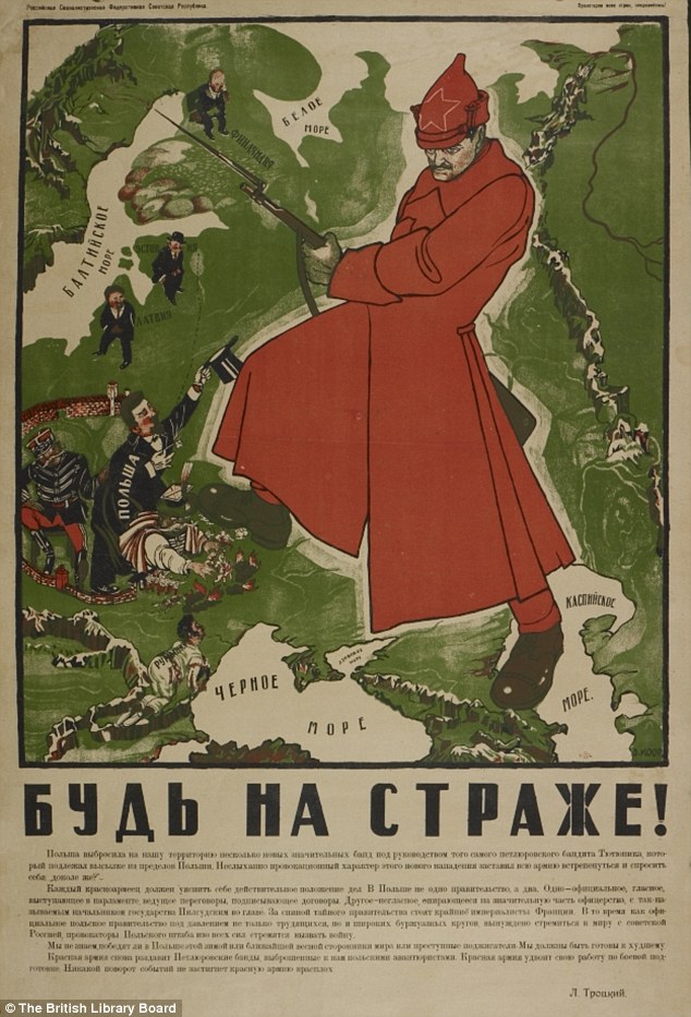
Dimitri Moor's 'Be on Guard!' map, 1921.
During the 1920s the USSR was still in its infancy. It was continually threatened by social unrest, famine and invasion. This map of a Bolshevik red guard fending off invaders and being a strong force for Russia helped to define the Soviet Union within the imagination of people at the time. Political maps in a poster format would work really well as part of a larger collection grouped together on the wall.
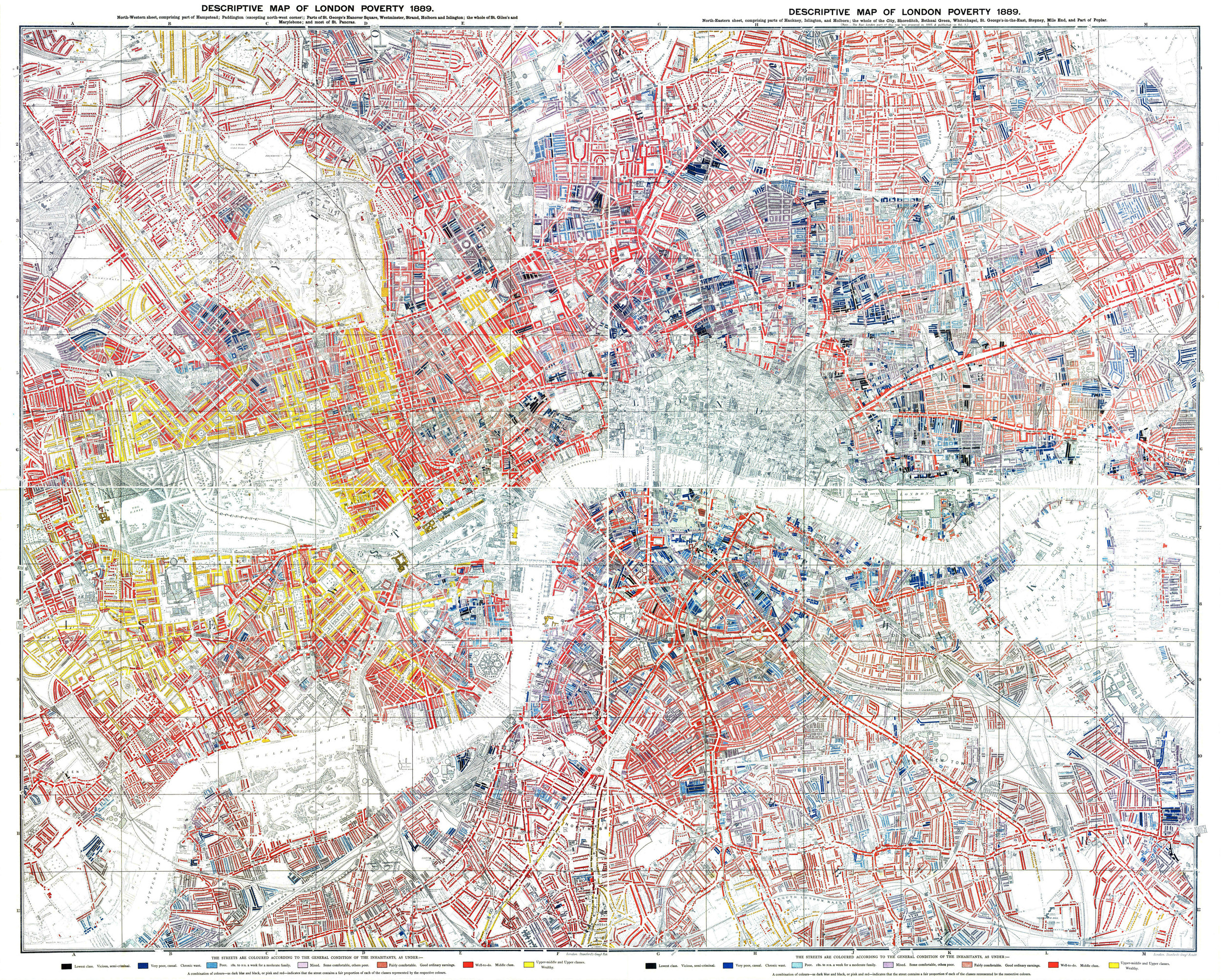
Descriptive map of London poverty, 1889.
In 1889, business Charles Booth sought to investigate the true extent of poverty within London, producing this map as a result. It highlights the economic conditions across the capital using seven colour categories, from black for 'Lowest class, semi-criminal' to gold for wealthy. It found that 30% of Londoners were living in poverty and galvanised the Government into action; the first council houses were built shortly after this was produced. Hang this on your wall and you'll showcase a piece of history.

Harry Beck's London Tube Map 1933.
One of the most iconic maps, this was first submitted by Harry Beck in 1931 and it still looks modern 85 years later. Rather than a dense interweaving tangle of lines, he created an elegant and readable map by placing stations at a similar distance apart, regardless of their exact locations geographically. Maps of a city's underground can be a great reminder of any time you've spent there.
In more recent times, we've started to play around with the look and feel of maps. Artists are experimenting with form, colour and look to make graphical displays that are like works of art in their own right.
If you're looking for something to hang in your kitchen or dining room, you'll love the real food maps created by New Zealand photographer Harry Hargreaves. In collaboration with food stylist Caitlin Levin and typographer Sarit Melmed, Hargreaves has produced a series of country maps made using the iconic foods of the countries and continents they depict. Each map is made using real food.
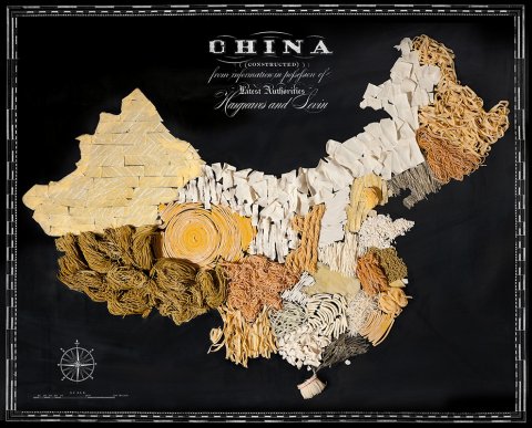
China is made out of various types of noodles
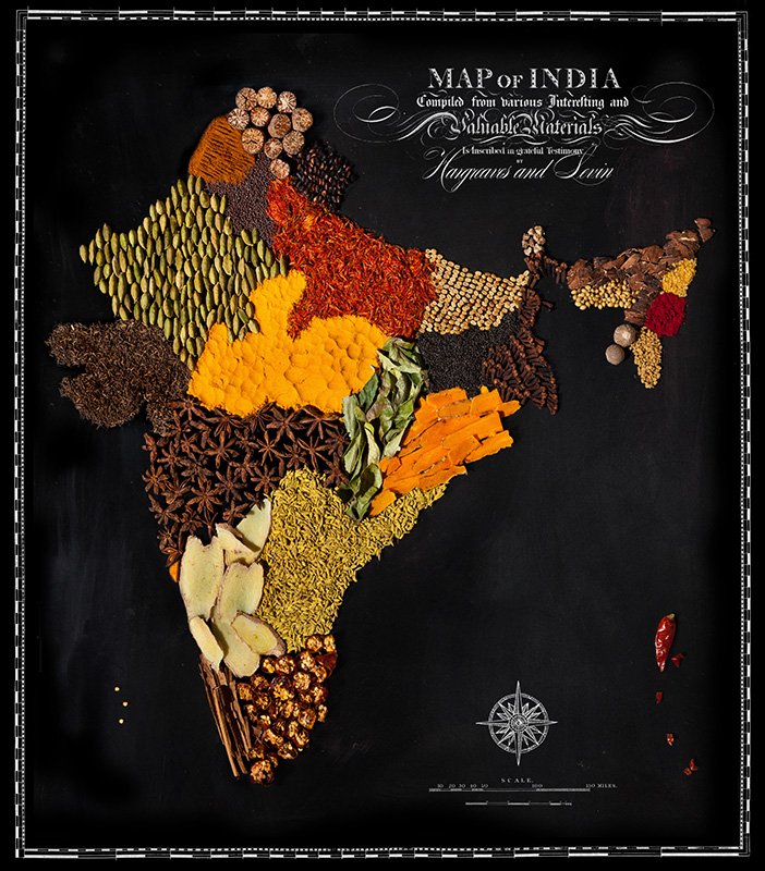
India is made from different spices
See more amazing work from Hargreaves and Levin on their website here.
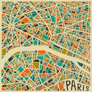
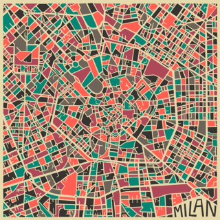
If you like more of a mid century vibe, you should definitely check out the re-created city maps by self taught and Toronto based artist Jazzberry Blue. Beautifully executed with a limited colour palette, they would give a room an art deco edge.
Maps are by their nature varied. And with so many different colours, types, sizes and shapes, they can look great in any room as either a main feature or a small accessory. Check out the decor ideas below for some map inspiration:
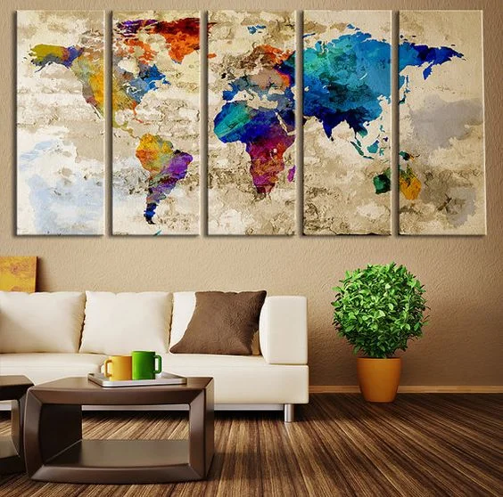
A bright and colourful map against a neutral background can really pop. Pick out one or two colours from the map and bring them into the room.
I really like this room. The monochrome map gives it a chic and classic simplicity.
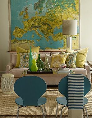
This room uses the colours from the map as a starting point for decoration. This creates a cohesive scheme.
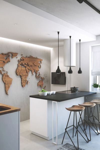
The beautiful 3-D wooden map is both sleek and tactile. The wooden stools bring it further into the room. The overall look is understated and elegant.
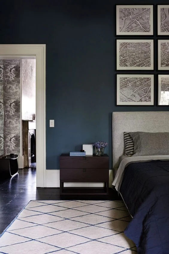
The rich wall colour gives this room depth and the display of maps above the headboard really stand out as a result. The dark floor and bedspread ground the wall colour, while the grey headboard, pillows and neutral rug unify the maps with the rest of the room.
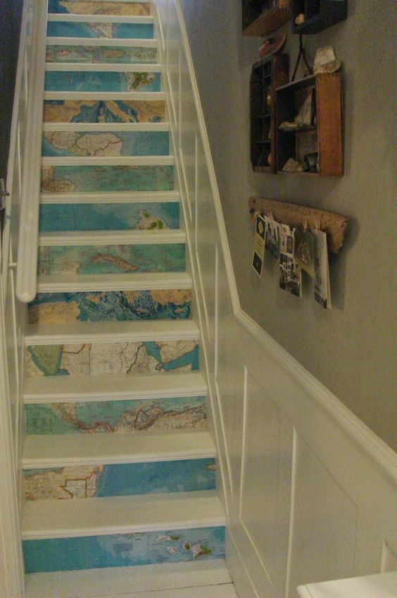
Don't be afraid of using map prints in unexpected places!
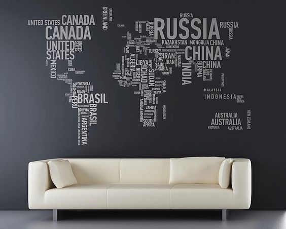
This word map really stands out against the dark background. A modern, minamilist look.

The gold tones of this wall map are soft and warm. The rest of the room is rightly neutral, decorated in warm shades of beige. brown and 'greige'. Cosy and elegant.

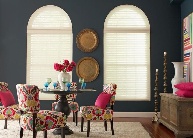
This dining area displays a really interesting and eclectic display of different maps in varying frames and colours. They work well against the white background and with the coloured chair.
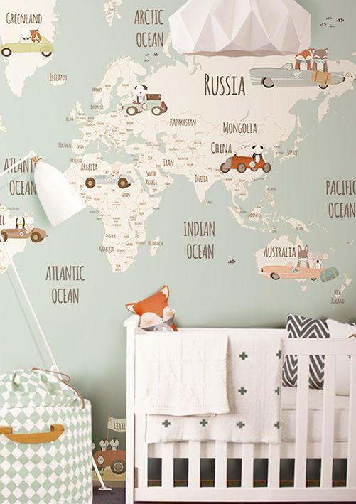
A fun map is perfect for a chid's bedroom.
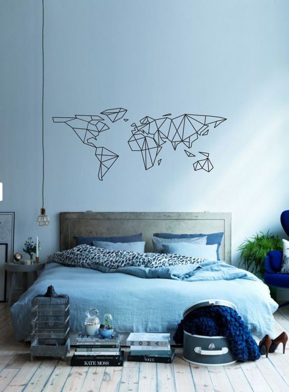
This graphical map works well here. The wall colour and soft furnishings use similar and complimentary shades of blue. This, together with the elements of grey in the room, soften the black of the map. The black flex of the lightbulb and black/white print on the duvet help bring everything together.

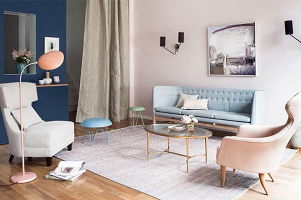
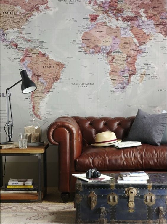
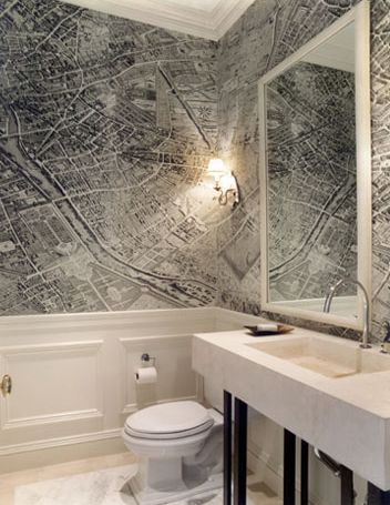
The maps in this room really help to add impact to this gentleman's club look. Using three different maps, but in similar tones mean they stand out, but do not overpower. The quirky furniture, objects and floor light look great against the antique map background.
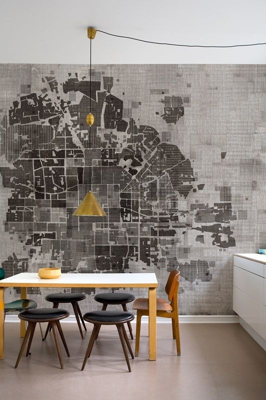
A lovely room. The gold lampshade pops against the black and white map and draws your eye to its centre before you take in all of the map and then the rest of the room. The black stools and light table help to actor the map in the room, so everything is brought together.
beautiful foundations claims no credit for any images posted on this site unless otherwise noted. Images on this blog (beautiful-foundations.com) are copyright to their respectful owners. If there is an image appearing on this blog that belongs to you and you do not wish for it to appear on this site, please contact me with details of which image you refer to and it will be promptly removed. Any image on this site is here because it is thought to be beautiful.