Going Green

What’s in a colour? How does it affect us, our mood, our sense of wellbeing? Can a colour sum up a point in time or a year? Pantone clearly think so as they’ve released their colour for 2017. The colour which they think sums up our zeitgeist for this year ahead.
Green. And not just any green, Greenery. The name of the colour is even a thing in itself. And it shows that they believe we want to be closer to nature this year.

This is a bright green, a ‘zesty yellow-green’ shade, which is meant to evoke the newness of spring and our yearning to be more at one with the natural world. It’s a chance for us all to take a step back from modern life, slow down, take a deep breath and appreciate the beauty of nature.
Picture: designshack.net
Leatrice Eiseman, Executive Director of the Pantone Colour Institute explains this further: “Greenery burst forth in 2017 to provide us with the reassurance we yearn for amid a tumultuous social and political environment. Satisfying our growing desire to rejuvenate and revitalise, Greenery symbolises the reconnect we seek with nature, one another and a larger purpose”.
This colour has big shoes to fill! Though it is no secret that many people were pleased to reach the end of 2016. It was such a turbulent year with a lot of change across the political, social and personal spectrums. At the start of this year, we have the opportunity to make a new start, a new beginning. The slate is wiped clean. 2017 holds the promise of possibility and perhaps utilising a colour, such as Greenery, can help us visualise this change and keep it at the forefront of our mind.
In the psychology of colour, green is a balancing colour, though also invigorating, as it represents growth and vitality. It’s also believed to promote health and healthy eating.
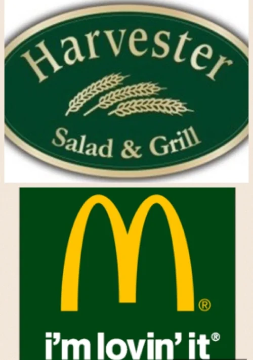
McDonald’s and Harvester are trying to harness the positive energy of green to help change our perceptions of their brands. They are literally trying to turn ‘green’.

Fashion brands too are harnessing this energy in their clothing ranges for spring and summer. You can wear green to feel green!
Picture: uk.pinterest.com/ninayay/

Source: shilpaahuja.com
In the home design sphere, green can easily be incorporated into your room scheme. Greenery is a bold colour! And you can use it as much or as little as you’d like. Whether you like a paired down, subtle look, or a bright and zingy room, here are some green looks to get you excited about the start of something new:
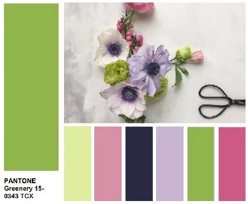
Surprisingly versatile, this strong green can hold it's own with a variety of colours. Just as in nature, the predominant backdrop to the vivid hues of flowers is green, so too the same can be replicated in the home. Think of the pinks, dark purples and yellow above. But also consider it if you like copper, white and rich teal.
Picture: milanstyleguide.com

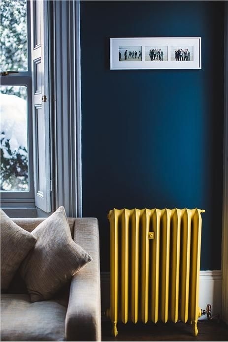
The bathroom is one of the best (and safest!) places to try out this colour. Traditionally a bathroom suite is white and it goes so well with Greenery. What's made a difference in this bathroom is the use of white marble as a splash back, which provides texture and interest to the white. And the way the owner has added the black framed plant pictures. They break up the colour, but at the same time re-inforce it and what it represents. Very effective. I love too the plant peeping in at the side.
Picture: due-home.com

If you're ready to be a bit bolder and bring out the green into your dining space - a wise choice to promote healthy eating after all - take a look at these dining rooms. Two rooms both influenced by Greenery and yet two very different looks. In the above picture, the warmth of wood goes so well with green. They really compliment each other and the gold legs add a sense of luxury. The incredible view, the colourful picture and objects on the table mean there are colours and objects which balance out the strong green.
Picture: frenchbydesignblog.com
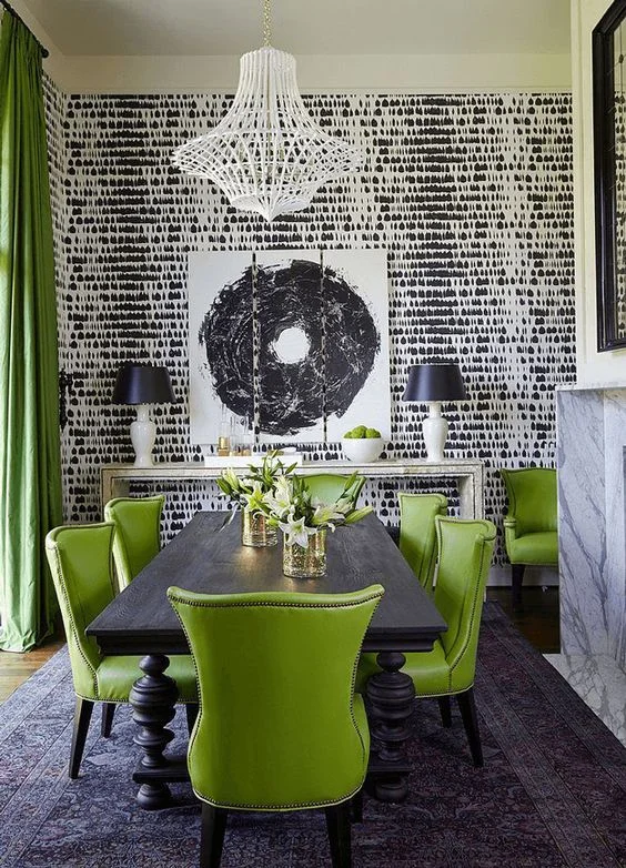
In this dining room, the vibrant green is matched by a strong monochrome palette in the rest of the room. This is needed to balance the colours and make the room not feel dominated by any one colour. It's modern and yet feels traditional too. You need a high ceiling for this look.
Picture: brabbu.com

Maybe you crave more of a change? Perhaps you're ready to fully embrace Greenery and really bring the outside in... This home is lucky enough to have a window which looks straight onto greenery. Look how well it goes with the rich teals and greens inside! A warm wood floor ad white table soften the look.
Picture: themakerplace.co.uk

Another example of how well bright green can look against a dark teal backdrop. Break the blocks of colour up with wood, white and flashes of warm tonal colours - here the orange light and red on the desk.
Picture: networkveka.co.uk

For those die-hard grey fans, this zesty green even works with this rich grey wall. See how it gives the opportunity to use gold, glass and mirrored objects and brings an opulence to the whole room. The green sofa here really 'pops' - I wonder if a green velvet one would look even better.
Picture: themakerplace.co.uk

If you're especially brave, embrace this kitchen. Wow! The units are incredible. I love the copper splash back which brings light and draws your eye into the room. A dark blue floor completes the scheme.
Picture: bykoket.com
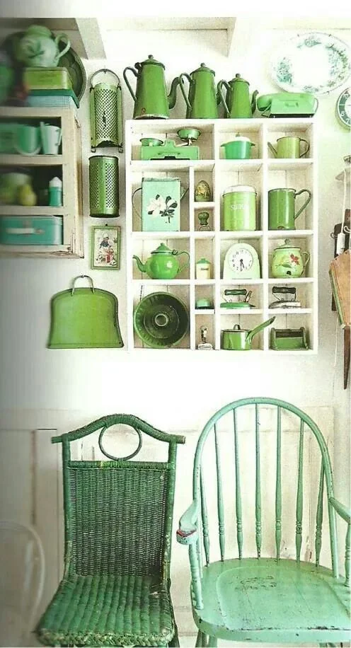
Or if you'd prefer a simpler way, collecting green crockery and kitchen accessories is an easier way to start incorporating this hue into your home!
Picture: blog.seaofatlas.com

If you're feeling a little overwhelmed and don't really know where to start, this is a simple and classic way to literally incorporate some greenery in your home. Find a beautiful green plant and add it to a stylish copper pot. Perfect!
Picture: sheerluxe.com
No matter how you try and take on this new, positive outlook for 2017, and ‘greenify' your life, let’s all make this year a wonderful one! Happy New Year!
beautiful foundations claims no credit for any images posted on this site unless otherwise noted. Images on this blog (beautiful-foundations.com) are copyright to their respectful owners. If there is an image appearing on this blog that belongs to you and you do not wish for it to appear on this site, please contact me with details of which image you refer to and it will be promptly removed. Any image on this site is here because it is thought to be beautiful.